For designers, few media are held more sacred than the book cover. Its typically vertical, rectangular shape has long been a playground for designers to explore grids, typography, illustrations, photography, and the hierarchy determined from their arrangement. But with the recent rise of digital content consumption, book designers find themselves facing a more challenging space: the scaling square.
It might seem strange to put so much importance on cover art when the product—in this case, digital audio — is intangible. For Audible’s creatives, however, design is critical because a cover must stand out in the context of Audible’s vast audiobook library, where purchase decisions are made.
Equally critical is the size consideration. “It’s hard to balance design to be legible when small [while] not being blown out when scaled up,” says Audible designer Alex Odulio. In digital marketplaces, a single cover can appear in three dramatically different sizes — all on the same page. As if maintaining visual clarity within those digital parameters wasn’t enough of a challenge, the best-selling books are often featured in marketing campaigns that can extend to a much larger scale, meaning billboards. “Simplicity wins” when it comes to this larger scale, says another Audible designer, Kári Emil Helgason.
There’s also a strategic challenge that underlies every design decision: a changing brand. “As Audible adds more and more A-list celebrities to its talent roster, as well as original audio-only productions, it was important for us to take cover design to the next level, too, to adequately reflect this new era for Audible,” says Phil Bratter, creative director of Audible’s Brand team.
INSERT IG POST HERE
So how does a small design team manage this task with 250-600 book covers passing through the department in a given month? Well, that depends on the title. The majority of covers are converted from their original longer, rectangle-shaped paper format to the digital square format via a masterful crop. But when designing for Audible Studios, the in-house publishing arm of Audible, the content is entirely original — there is no print version to refer to — and so the design solutions must be original as well.
Those solutions are the result of “a collaborative effort between the audiobook’s acquiring editor, the marketing team, and creative,” explains David Lipsky, senior director of Business Affairs & Content. Lipsky’s team works with the creative team on about 10 high-profile, wholly original covers a year. He says his considerations, when evaluating a design, include: Will it stand out from other covers? Is the balance between imagery, title, author name, and narrator right? Will customers be able to see everything on the cover, even on a mobile phone screen? And, simply, does it lookawesome?
The process for designing covers like The Art of War, a title for which Odulio’s cover design was nominated for an Audie, begins with researching pre-existing covers, noting any thematic consistencies between them. This helps the design team understand what’s out there, and how to stand out. To keep the title recognizable, he reinterpreted the book’s color palette, symbols, and use of contrast, and then translated them to a fresh digital application.

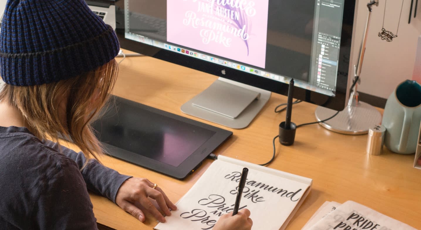
When tasked with reimagining classic titles read by a celebrity, the Audible design team will often work with outside agencies, designers, or illustrators to create something that hasn’t quite been done before. Recently, they’ve tapped famed letterer Jessica Hische and designer Gail Anderson, both of whom aptly captured genre and mood, all the while maintaining a visual hierarchy that celebrates the classic titles, the celebrity narrators, and the renowned authors. In the process, they kept the composition simple, limiting the color palette and focusing on evocative typography.


With other audiobook covers, the team got to have fun making design decisions that played with the challenge of adaptability. They worked with illustrator and Pinterest superstar Levente Szabó to tell layered stories for both the covers of Peter Pan and Alice’s Adventures in Wonderland. “We see distinct silhouettes that reveal details from the story when the image is displayed larger,” Helgason points out. “Both covers capture the darkness of these stories that appeal to adults and the playful sense of wonder that children love.”
Choosing a social media sensation like Szabó for the job was no accident. “We wanted someone who understood how to catch the eye in even the most visually busy contexts, like Pinterest, where he is a breakout star,” says Bratter. “Strategically, bringing in rock star designers like Levente, Jessica, or Gail, matches and elevates titles in a way befitting our ever-growing roster of celebrity narrators,” like Scarlett Johansson or Lily Collins.
Lipsky notes the cover for Peter Pan as a personal favorite. “I love how Peter and Tinkerbell look like they’re casually exchanging stories, as we might enjoy the audiobook as listeners, plus the colors really stand out; I think this would be a great framed poster for a child’s room.”

Occasionally the team goes all-in on genre tropes. With the wacky, fun sci-fi parody The Adventures of Tom Stranger, Interdimensional Insurance Agent, says Odulio, “we discussed the aesthetic of the Big Trouble in Little Chinamovie poster, [and since we] wanted it to really live in that world, the design inspiration was heavy on ’80s sci-fi imagery.” The Audible team brought that vision to life by partnering with ilovedust, a UK-based studio, who took the direction and ran with it for the final illustration style and cover:

So, yes, designing digital cover art is fun — but strategy and functionality are always critical considerations. First, decide the hierarchy of information; research an art direction that evokes the mood of the story; and finally, design for scalability, comparing the work at all intended sizes. Once these things come together, that is when the magic happens … for both designers and viewers.


